Urban Green Cover and Built-up Analysis for Sydney-region | I Hug Trees
Monthly Analysis of City Vegetation for Sydney-region, tracking vegetation health and urban development trends from satellite data. This digest integrates NDVI and NDBI indices, highlights zones of vegetation stress versus built-up surfaces, and assesses urban heat island effect with heat-risk mapping and 3D visualizations.
Published on: 2025-10-20
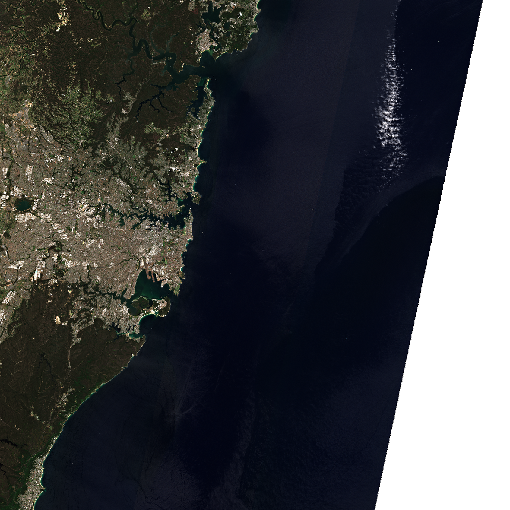
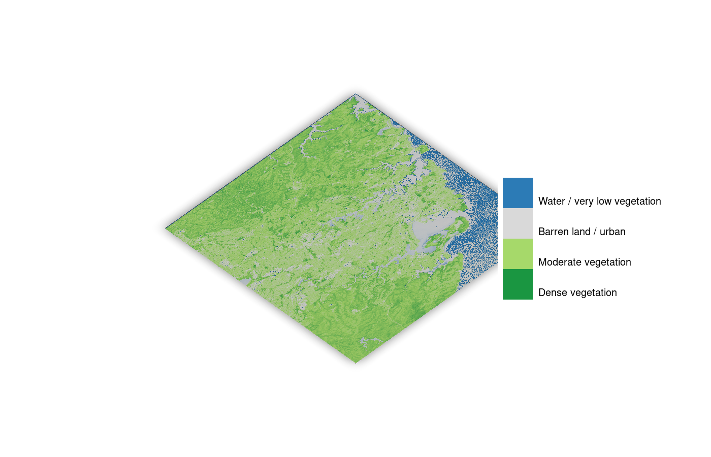
This preview, captured by the Sentinel-2 satellite from its orbit at approximately 786 km above Earth, shows the Sydney-region Imagery observed on 2025-10-15.
This month's environmental digest for the Sydney region uses Sentinel-2B satellite data from October 15, 2025, with minimal cloud cover of 0.092%. We analyze Normalized Difference Vegetation Index (NDVI) for vegetation health and Normalized Difference Built-up Index (NDBI) for built-up intensity. This monthly update, curated by I Hug Trees, highlights the contrasting landscape of vegetation and urban development in the region.
Info Box for Awareness
Why this matters
At I Hug Trees we turn science into awareness so that we understand how humanity's effort and nature's wonders shape the living balance of our green spaces. The green patches around the globe vanish and recover telling us a story of resilience and renewal. Is it not? As we aim to bring scientific credibility into our numbers and maps we help everyone see what connects us all.
Understanding NDVI and NDBI
Satellites like Sentinel-2 capture sunlight reflected from the Earth in many narrow colour ranges, called spectral bands. Plants and trees reflect more light in the near-infrared band and absorb more in the red band, that’s how NDVI helps us see how green or healthy an area is. NDBI uses other bands to highlight built-up areas, showing how vegetation and development change side by side. Together, they help us understand the story of our landscapes, where green spaces thrive and where it needs care.
Methodology
NDVI (Normalized Difference Vegetation Index) values were derived from Sentinel-2 imagery using red (B04) and near-infrared (B08) bands. Cloud masks were applied using QA60 flags. Images were processed at 10 m resolution through the Microsoft Planetary Computer API. Monthly NDVI averages are compared over time to assess vegetation trends and greenness changes. Note: Some summary insights in this analysis were generated with the help of AI tools. All satellite data and numerical outputs are based on verified Sentinel-2 observations.
Data integrity & processing note
All datasets are processed using open satellite imagery from the Microsoft Planetary Computer and verified with consistent parameters such as cloud cover, resolution, and band alignment. Each NDVI and NDBI image is generated using reproducible Python workflows to maintain scientific credibility.Data processing and map generation were performed using AWS cloud infrastructure.
NDVI & NDBI Historical Trends - Sydney-region
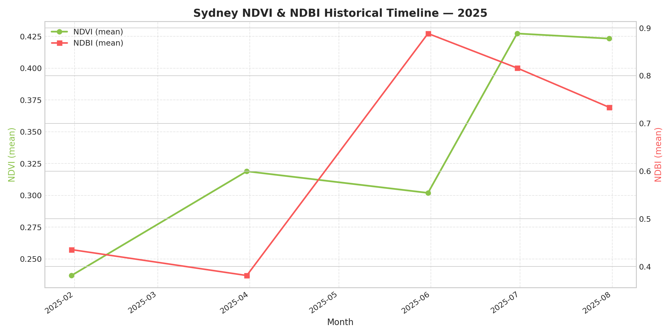
This graph shows monthly NDVI and NDBI values, capturing how vegetation and built-up areas changed across the Sydney-region throughout the year.
NDVI
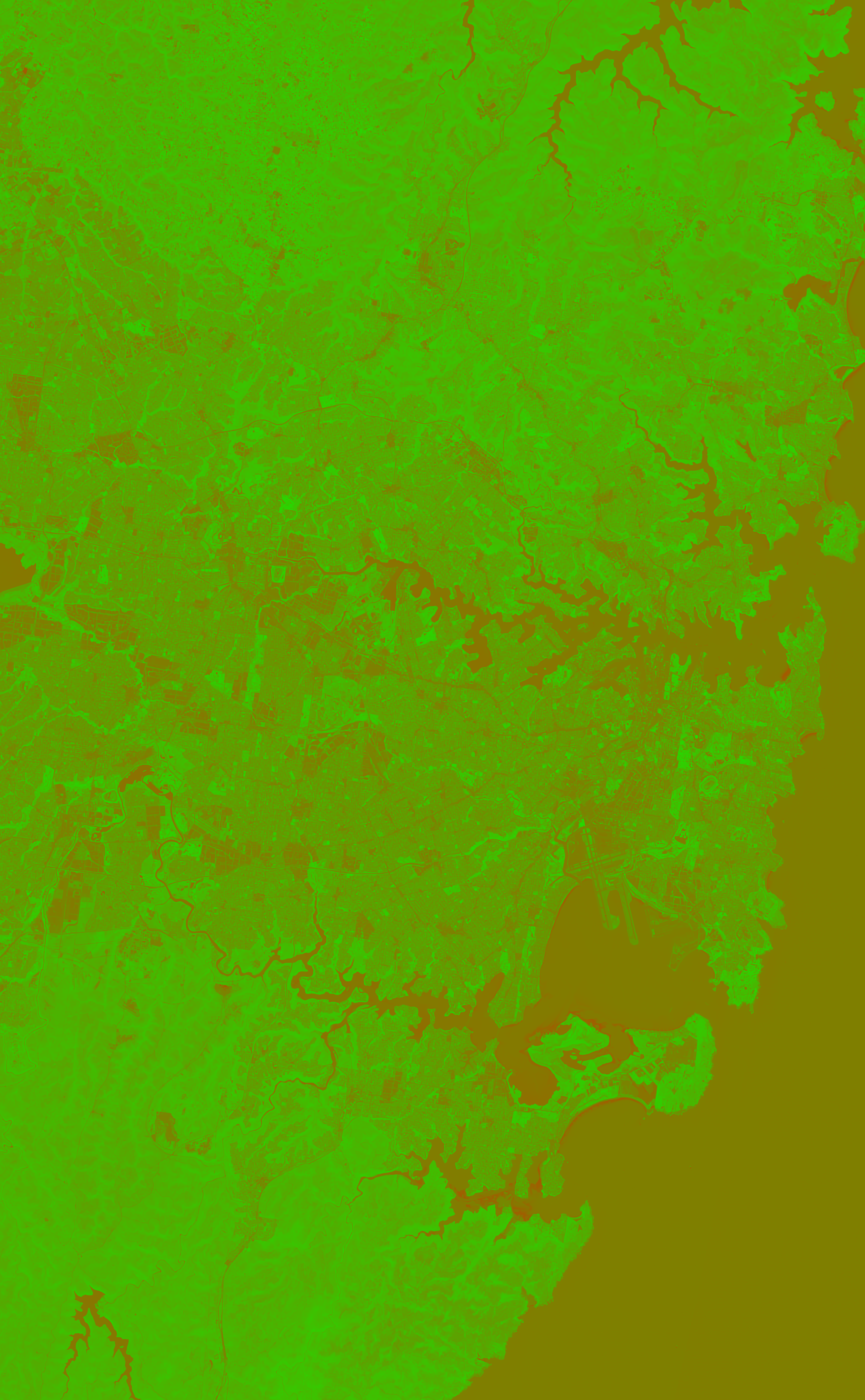
NDVI — color visualization
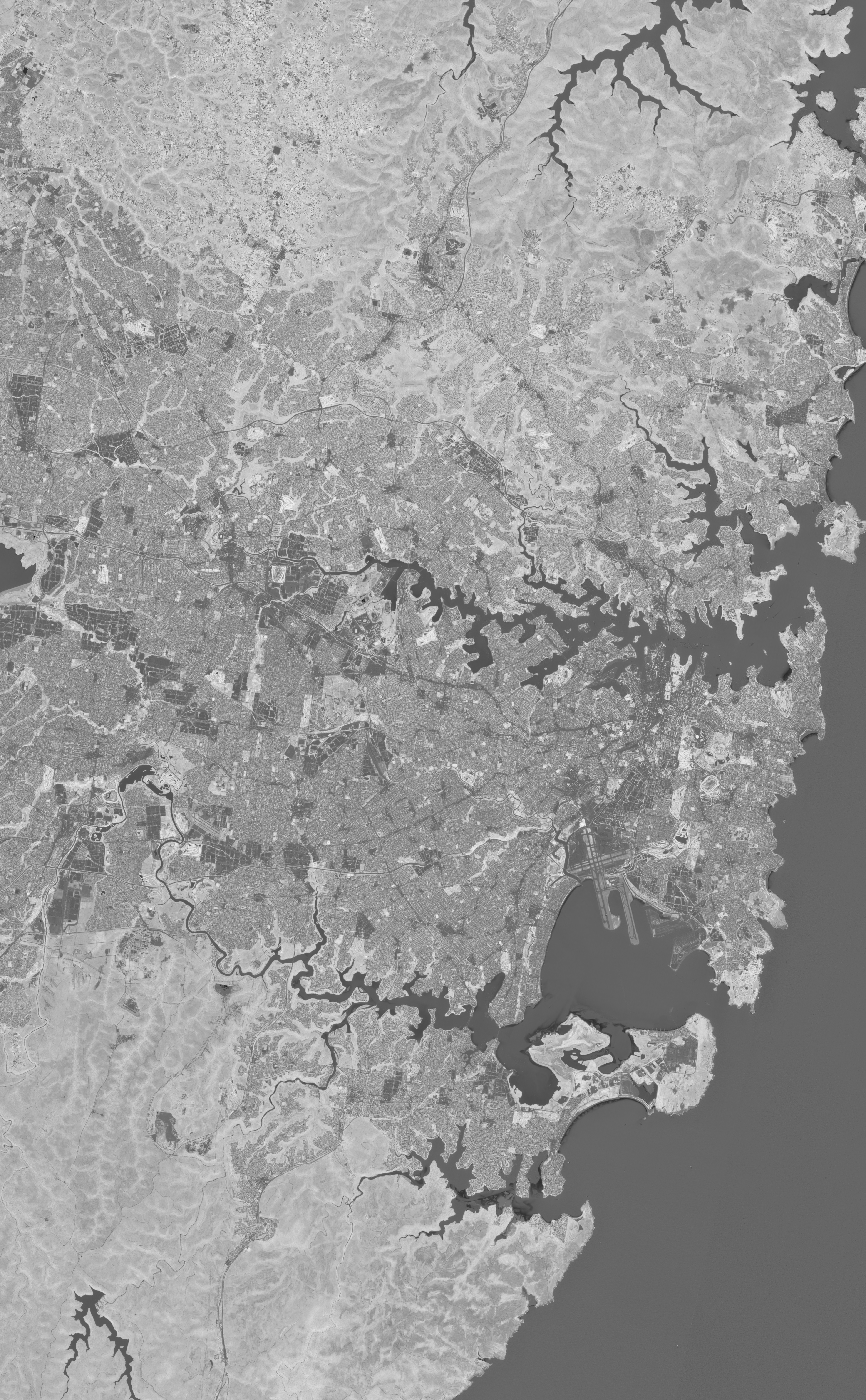
NDVI — greyscale (index values)
NDVI csv values
| min | max | mean | median | stddev |
|---|---|---|---|---|
| -0.5257923007011414 | 0.7839318513870239 | 0.26358547806739807 | 0.29981377720832825 | 0.18115338683128357 |
NDBI (Built-up Index)
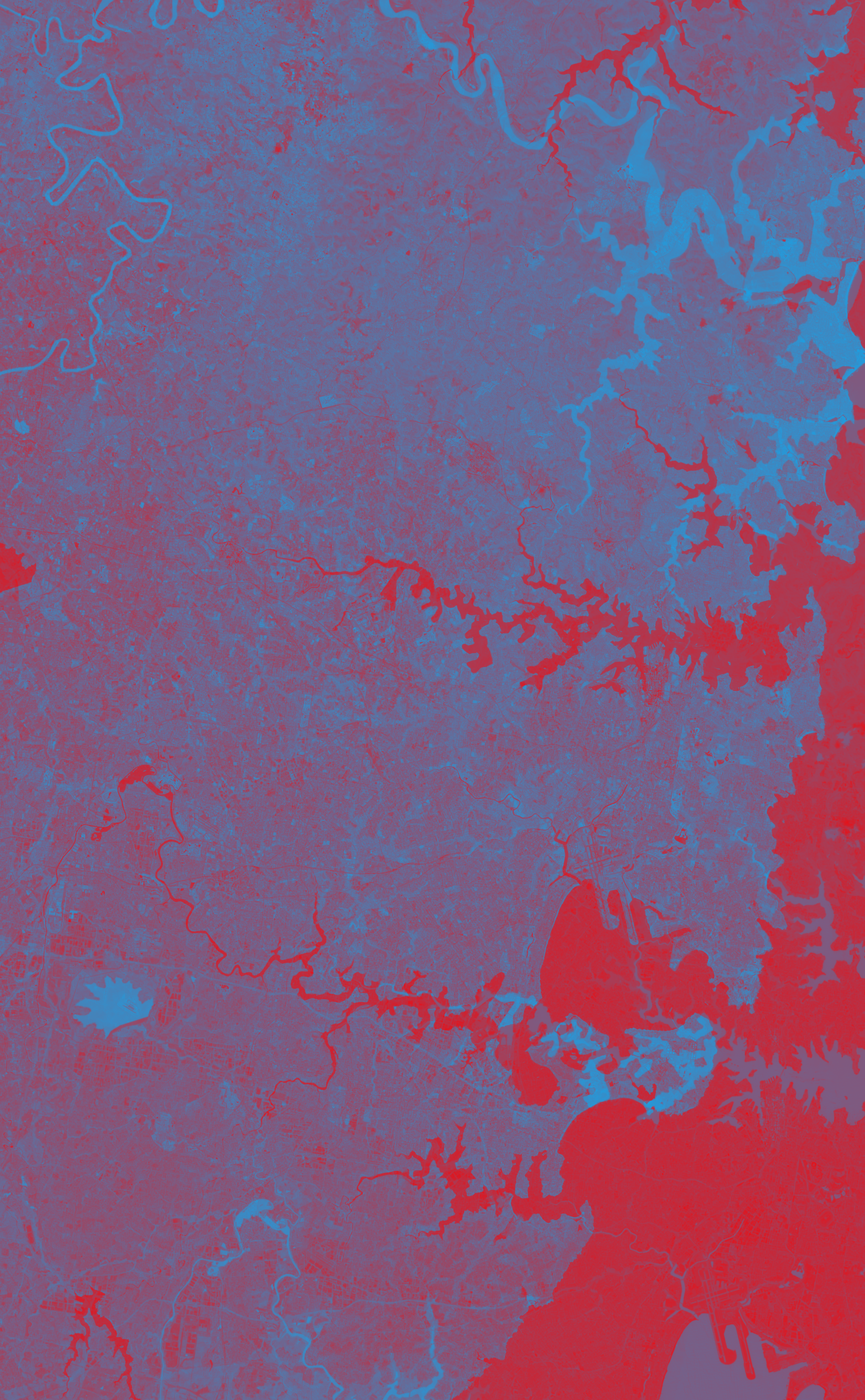
NDBI — color visualization
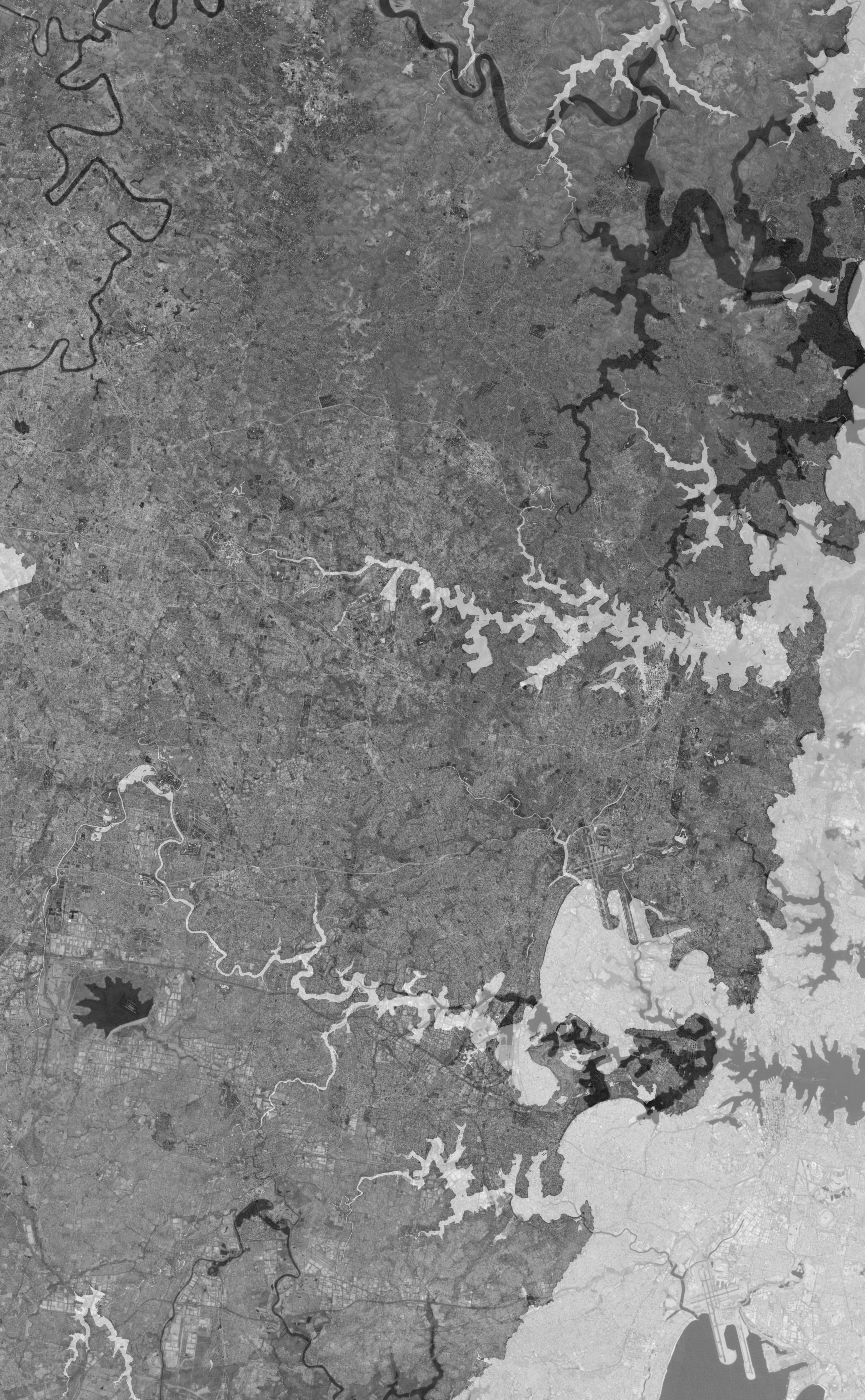
NDBI — greyscale (index values)
NDBI csv values
| min | max | mean | median | stddev |
|---|---|---|---|---|
| -0.8828901648521423 | 0.859993577003479 | -0.01026962324976921 | -0.05360642075538635 | 0.25779247283935547 |
NDVI − NDBI & Heat Risk
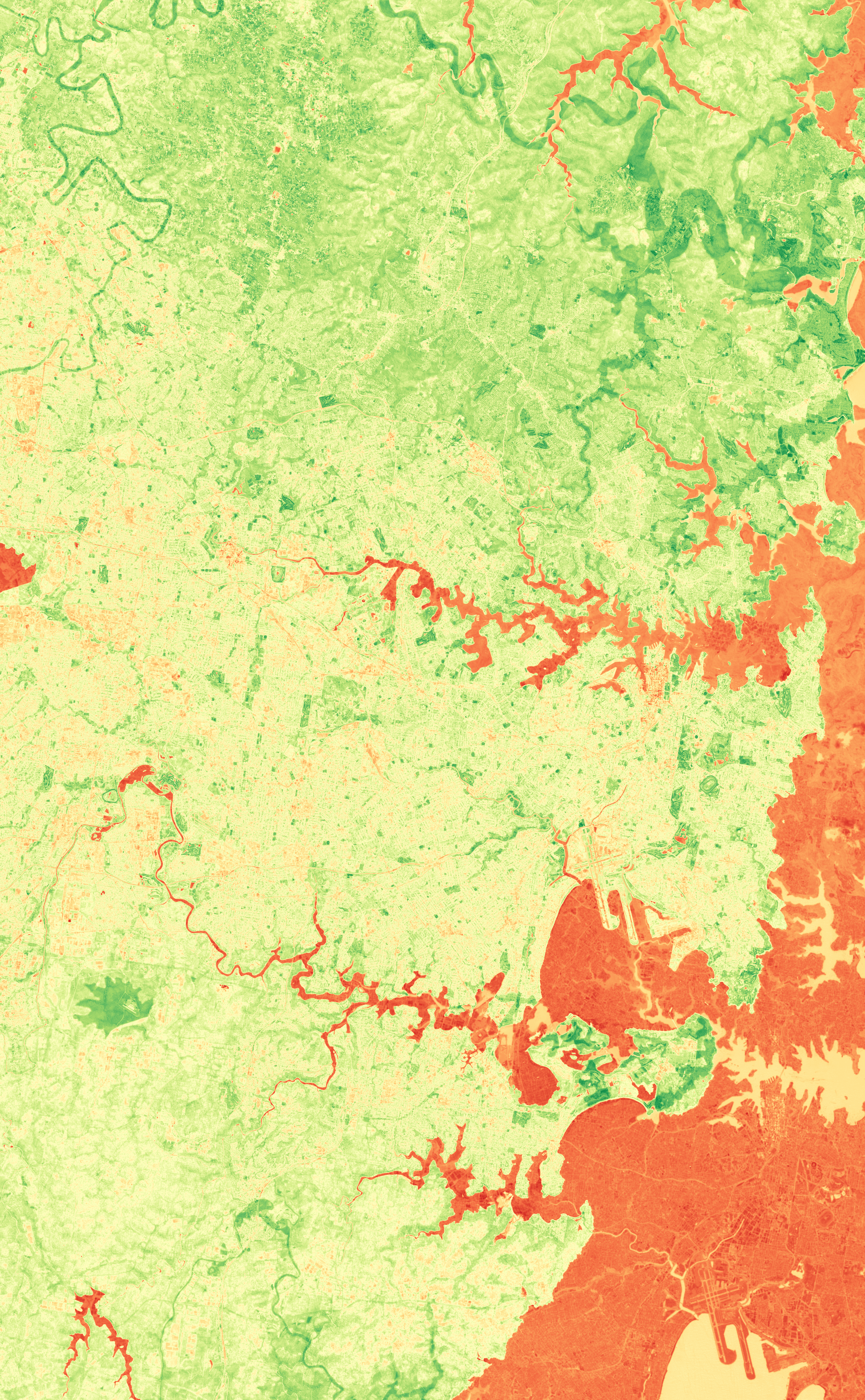
Difference visualization — highlights vegetation vs built-up dominance.
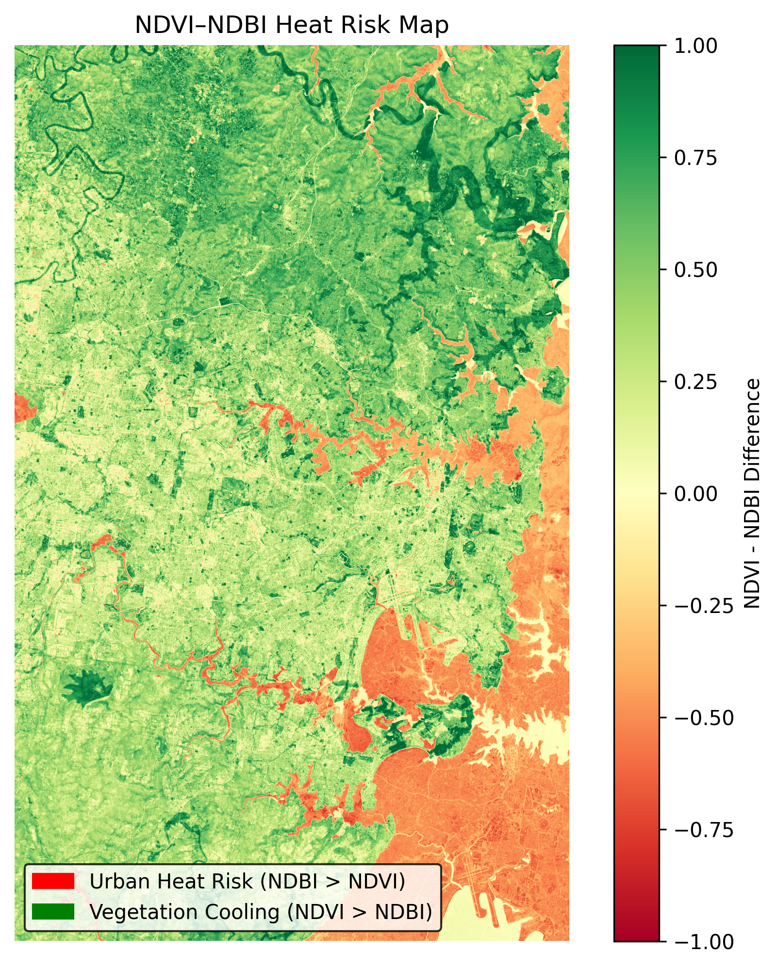
Heat risk interpretation derived from NDVI–NDBI difference.
The NDVI values range from a minimum of -0.526 to a maximum of 0.784, with an average of 0.264 and a median of 0.300. This indicates a varied landscape with significant vegetation cover. The standard deviation of 0.181 suggests moderate variability in vegetation density across the region.
NDBI values show a minimum of -0.883 and a maximum of 0.860, with an average of -0.010 and a median of -0.054. This suggests that, on average, vegetation and open areas predominate over built-up surfaces. However, the high maximum value indicates the presence of dense urban areas.
Comparing NDVI and NDBI, the mean difference (NDBI - NDVI) is -0.274, indicating that vegetation predominates over built-up surfaces in the Sydney region. Areas where NDVI exceeds NDBI are likely to have cooling effects, while areas where NDBI exceeds NDVI are flagged as higher heat-risk zones (see ndvi_ndbi_diff_color.png).
- Focus on preserving and expanding green spaces in high NDVI areas.
- Monitor and mitigate heat risks in high NDBI zones.
- Encourage urban planning that integrates more vegetation in built-up areas.
3D Renders (Rayshader & Rayrender)
Rayshader 3D visualization derived from NDVI height-extrusion
Rayrender 3D visualization derived from NDVI height-extrusion
Interactive NDVI overlay (zoom, pan, transparency). Use it alongside the static maps above.
Use the interactive overlay (ndvi_map.html) to explore the region in detail. Zoom in on areas of interest, adjust the transparency slider to compare NDVI and NDBI layers, and validate features against high-resolution basemaps. Note that cloud cover, though minimal at 0.092%, may affect some areas. Immediate next steps include field validation of key findings and establishing a regular monitoring cadence to track changes over time.
Urban heat island effect
Our analysis indicates that vegetation predominates in the Sydney region, with a mean difference of -0.274 (NDBI - NDVI). This suggests significant cooling effects from green spaces. However, urban heat risks remain in areas where built-up surfaces are dense. We recommend monthly monitoring to track changes, prioritizing green space restoration in high-heat-risk zones. Call to action: Engage with local communities to promote urban greening initiatives.
Disclaimer: this analysis refers to the satellite crop / geo-bounds stored under the 'Sydney-region' folder (may include extended suburbs) and does not represent the full administrative limits of Sydney.
Get involved
Every dataset, image, and map here is part of a bigger mission — to connect people with the science behind urban greenery. If this work inspires you, there are more ways to explore and participate:
- Read our Urban Forestry Daily Digest — a quick way to stay updated on global green space insights and local restoration efforts.
- Explore the latest Melbourne NDVI Digest to see how vegetation trends compare across regions.
- Visit our feature article Urban Forestry and Green Living to understand how urban forests improve our health, climate, and community life.
Join us in sharing awareness, supporting greener city planning, and bringing data-driven stories of hope to light. Email: nature@ihugtrees.org Have a place in mind you’d like us to study next? Share the city or region name where you’d love to see an NDVI and NDBI analysis.
Alternatively, send us an email directly. We review every suggestion to understand where green monitoring can create the most impact.References & Data
Free to Download (Please cite):
I Hug Trees NDVI Data Citation:
The NDVI and NDBI GeoTIFF and images are provided by I Hug Trees for scientific purposes. Please cite as:
    @misc{ihugtrees_ndvi_2025,
      author    = {I Hug Trees},
      title     = {NDVI and NDBI Analysis Data - Chennai region 2025},
      year      = 2025,
      note      = {GeoTIFF and images provided for scientific purposes},
      url       = {https://ihugtrees.org}
    }
Microsoft Planetary Computer Citation
If the Planetary Computer is useful for your work, please cite it using this record on Zenodo:
    @software{microsoft_open_source_2022_7261897,
      author       = {Microsoft Open Source and
                      Matt McFarland and
                      Rob Emanuele and
                      Dan Morris and
                      Tom Augspurger},
      title        = {microsoft/PlanetaryComputer: October 2022},
      month        = oct,
      year         = 2022,
      publisher    = {Zenodo},
      version      = {2022.10.28},
      doi          = {10.5281/zenodo.7261897},
      url          = {https://doi.org/10.5281/zenodo.7261897}
    }