Global co2 Emissions: Trends, Impacts, and Data-Driven Insights

CO2 Emissions by Country: A Data-Driven Perspective
Climate change is one of the greatest challenges of our time, and understanding CO2 emissions is crucial in addressing it. Our latest data visualization highlights the Top 25 CO2 emitting countries, presented through two powerful charts—a Treemap, offering a hierarchical breakdown of emissions distribution, and a Barchart, providing a clear comparative ranking. Built using D3.js, a premier JavaScript library for interactive graphics, these visualizations bring raw data to life with clarity and impact. The data processing was powered by Python (Pandas), Google Sheets, and JavaScript, ensuring accuracy and accessibility. These insights are more than just numbers; they align with the United Nations Sustainable Development Goals (SDGs), emphasizing the urgent need for global action.
By making these charts free to download and reuse, we aim to support researchers, policymakers, and activists in driving meaningful change. Data speaks, and visualizations amplify its voice. Explore, analyze, and be part of the solution.
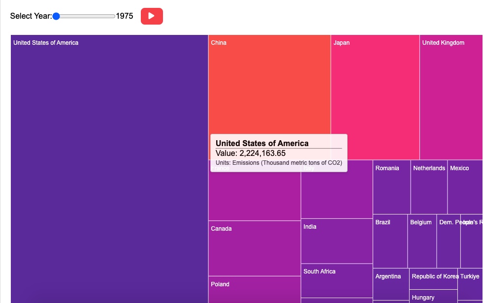
Top 25 CO2 Emitting Countries (Treemap)
The Treemap chart visualizes the top 25 countries by CO2 emissions from 1975 onwards, with each block representing a country’s share. The chart highlights contributions in thousand metric tons, revealed interactively via tooltips. Larger blocks indicate higher emissions, emphasizing major polluters. This visualization simplifies complex data, making it easy to
grasp each country's impact.
This content is licensed under the CC BY 4.0 license, allowing you to freely share and adapt the work as long as you give appropriate credit. The embed chart has no 'Brand-logo' intrusion as we understand our visitors' needs.
Insights: A Story Told Through CO2 Emissions
Imagine the Earth taking a deep breath—but instead of clean, fresh air, it inhales a thick cloud of carbon dioxide, heavier than ever before. The treemap and bar charts of the top 25 CO2-emitting countries tell this somber story. Each block, each bar, is not just a number but a reflection of choices made, opportunities missed, and challenges faced.
What Went Wrong?
China and the United States: The two giants at the top of our charts. China’s rapid industrial growth has been both its boon and bane. The country transformed from an agrarian society into the "world’s factory" in mere decades. But with factories came smokestacks, and with economic prosperity came environmental cost. Coal, the dirtiest of fossil fuels, still dominates China’s energy sector. The sheer scale of manufacturing, combined with urbanization and growing consumer demand, has led to an insatiable appetite for energy (World Population Review, 2024).
The United States, on the other hand, represents a different narrative—that of historical emissions. As the birthplace of the Industrial Revolution and the modern automobile, America's infrastructure was built around fossil fuels. Suburban sprawl, car dependency, and energy-intensive lifestyles have locked the country into a high-emission trajectory. Even as renewable energy sources grow, decades of reliance on oil, coal, and gas weigh heavily on the charts (World Population Review, 2024).
India: The story here is a balancing act. As one of the fastest-growing economies, India faces the dual challenge of lifting millions out of poverty while managing its carbon footprint. The reliance on coal for electricity and the explosion of vehicular emissions in its burgeoning cities have pushed its CO2 numbers higher. The aspiration for economic growth has, unfortunately, been tethered to carbon-intensive industries (World Population Review, 2024).
Opportunities and Challenges
Opportunities:
Countries like Germany and Japan show that it’s possible to decouple economic growth from carbon emissions. Germany's Energiewende (energy transition) is a beacon of hope, showcasing how investments in solar and wind can reduce dependency on coal (Federal Government, 2024). Japan, despite its post-Fukushima reliance on fossil fuels, is a leader in energy efficiency and technology innovations.
For China, the very scale that contributes to its emissions is also its biggest opportunity. As the world’s largest producer of solar panels and electric vehicles, China has the tools to pivot towards a greener future—if it chooses to.
Challenges:
The biggest hurdle for many of these countries is systemic. The United States grapples with political divides that hinder unified climate action. India struggles with energy poverty—how do you tell millions without electricity that they must wait for cleaner options?
Then there’s the developing world. Countries like Indonesia and Brazil are caught in the crossfire between economic development and environmental conservation. The lure of short-term gains from deforestation and fossil fuels often overshadows the long-term cost.
The Road Ahead
Looking at these charts, it’s easy to feel overwhelmed—but every story has a turning point. The data is a wake-up call, not a death sentence. Policies can change. Technologies can evolve. And perhaps, with collective effort, the Earth’s next breath will be a little lighter.
In the end, these charts are more than just data points. They are a reflection of humanity’s past and a glimpse into its possible futures. The question is—which story do we want to tell next?
Method and Data Processing
Step 1: Data Source and Collection
The primary data was sourced from UN data on CO2 emissions.
The dataset spans 1975 to 2021, covering global emissions data.
The latest update to the primary source was in November 2024.
Step 2: Data Preprocessing and Cleaning
The raw data was imported into Python (Pandas) and Google Sheets for initial exploration.
Missing values were identified and handled using imputation methods (e.g., forward-fill for time-series consistency).
Non-numeric data and irrelevant columns were dropped to streamline analysis.
Step 3: Data Filtering and Selection
The dataset contained CO2 emissions data for all countries worldwide.
A filtering criterion was applied to extract the top 25 emitting countries based on total emissions (measured in thousand metric tons).
Data was aggregated by year to ensure consistency across all countries.
Step 4: Data Analysis and Insights Generation
Using Pandas, descriptive statistics were generated to identify trends, including mean, median, and standard deviation of CO2 emissions.
Temporal trends were analyzed to observe year-over-year changes in emissions.
Outliers were identified and verified against the source data for accuracy.
Step 5: Visualization Using D3.js
The cleaned dataset was exported as a CSV file for visualization.
D3.js, a powerful JavaScript library, was used to create two key data visualizations:
Treemap: Showcasing the relative share of emissions among the top 25 countries.
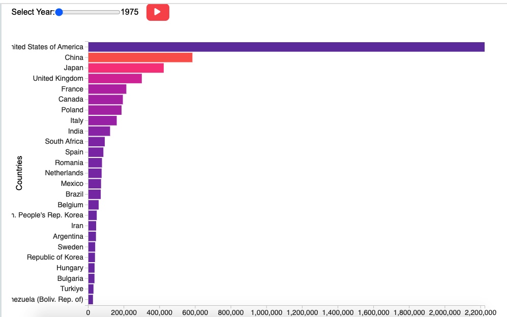
Bar chart: Displaying historical CO2 emissions trends for these countries over time.
Step 6: Insights from the Visualizations
The barchart highlighted significant emission growth from China, India, and the U.S. over the decades.
The treemap effectively illustrated the disproportionate share of emissions among a few nations.
Insights derived from these visualizations were included in the accompanying article on I Hug Trees to provide data-driven perspectives on global CO2 trends.
README: Global CO2 Emissions Dataset (Top 25 Countries)
Generated on: 2024-02-14
Created by: I Hug Trees (ihugtrees.org)
Dataset Title
Global CO2 Emissions (1975-2021): Top 25 Emitting Countries
Download link - CSV format
Global CO2 Emissions (1975-2021): Top 25 Emitting Countries
Date of Data Collection
Original data collected from 1975 to 2021, with the latest update in November 2024.
Data Source
Primary Source: United Nations (UN) CO2 Emissions Data
Processed and cleaned using Python (Pandas) and Google Sheets
Overview
This dataset provides a structured view of global CO2 emissions, specifically focusing on the top 25 emitting countries measured in thousand metric tons. It helps in analyzing emission trends, identifying key contributors, and supporting climate-related research and policymaking.
Data Processing Steps
Raw Data Collection – Extracted from UN data (1975-2021), ensuring the latest updates.
Data Cleaning – Missing values handled, outliers analyzed, and unnecessary fields removed using Python Pandas.
Filtering – Only the top 25 emitting countries were selected based on total CO2 emissions.
Formatting – Data structured into a CSV file for easy integration with analysis tools.
Visualization – Used D3.js to create an interactive treemap and barchart showcasing CO2 emission trends.
Data Format
File Type: CSV (.csv)
Columns:
Country – Name of the country
Year – Year of emission data
CO2 Emissions (Thousand Metric Tons) – Total CO2 emissions for the given year
Additional metadata for research purposes
Scope and Limitations
Focus: The dataset only includes the top 25 countries by total CO2 emissions, meaning lower-emission countries are excluded.
Updates: The latest data update was in November 2024, and future updates may change rankings.
Use Case: This dataset is ideal for trend analysis, policy research, and emissions forecasting, but does not cover all global emissions.
Usage and Applications
Climate change research and carbon footprint analysis
Comparative country-wise emissions studies
Data-driven policy-making for sustainability and carbon reduction
Interactive visualizations using D3.js
Software and Tools Used
Python (Pandas) – Data cleaning and processing
Google Sheets – Initial data structuring
D3.js – Visualization (Treemap & Barchart)
Access and Citation
For more insights and visualizations, visit I Hug Trees - Data Analytics.
If using this dataset, please cite I Hug Trees – Global CO2 Emissions Dataset (Top 25 Countries, 2024).
Understanding CC BY 4.0 and Giving Credit
The data visualizations, content, and insights on this page are shared under the Creative Commons Attribution 4.0 (CC BY 4.0) license. This means you are free to use, share, and adapt the materials, as long as you give proper credit to "I Hug Trees." Attribution ensures that the time and effort behind creating and sharing this knowledge are acknowledged. Here's how you can give credit:
The visualization chart is courtesy of "I Hug Trees - Data Analytics" . The primary dataset comes from [Data Source link - for example: UN Data ] or other third-party sources.
References
1. World Population Review: CO₂ Emissions by Country 2024 (2024)
2. Federal Government: Development of Renewable Energies (2024)