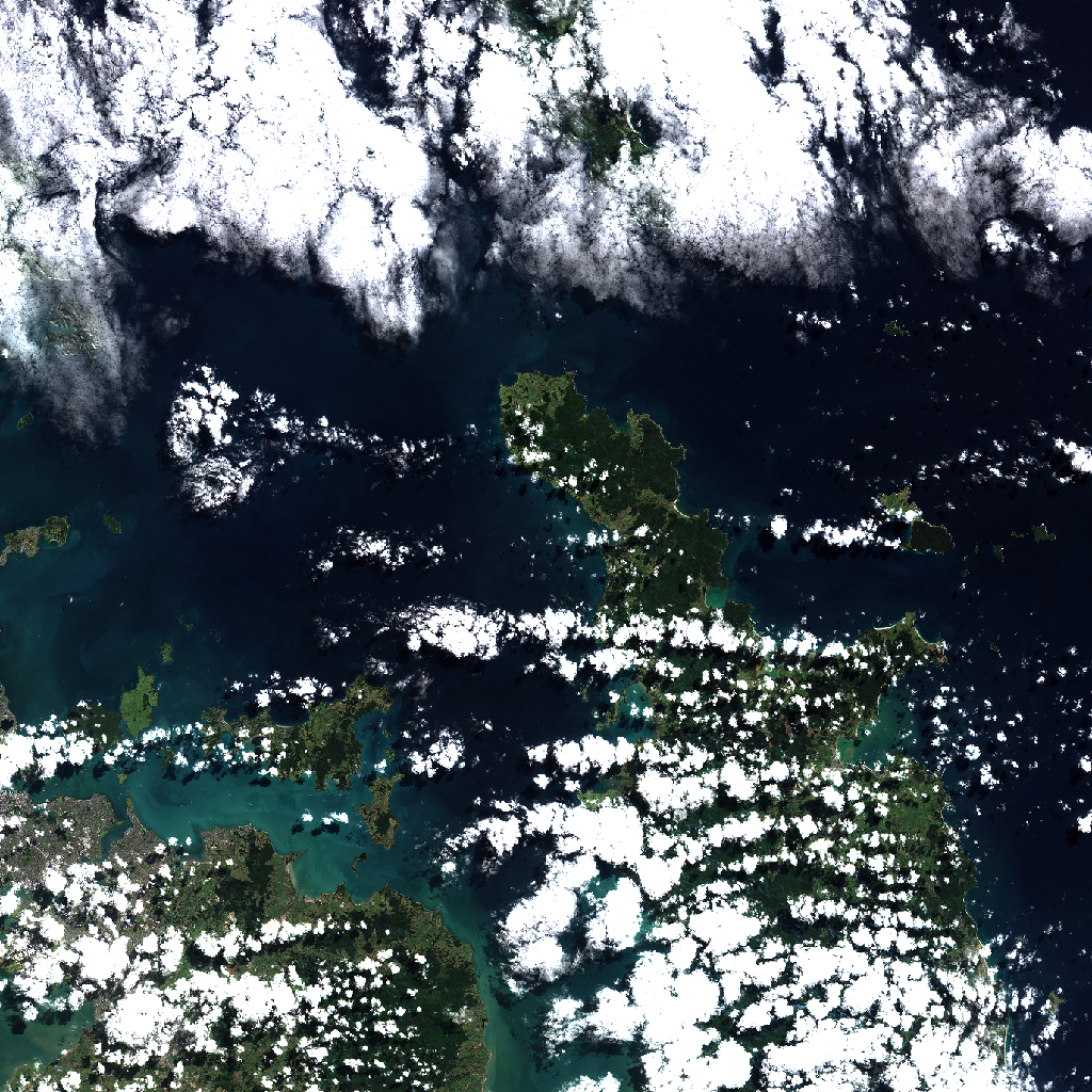
Sentinel-2 satellite preview of Auckland-region, captured on 2026-04-02 from an altitude of approximately 786 km.
Statement of Problem
Rapid urbanization and climate change are placing unprecedented stress on cities worldwide. As built-up areas expand and green spaces decline, urban heat islands intensify, air quality deteriorates, and residents face increased health risks. Understanding the spatial distribution of vegetation and development is essential for evidence-based urban planning, climate adaptation, and public health protection. This analysis quantifies the current balance between green cover and built-up surfaces in Auckland-region, identifies thermal vulnerability hotspots, and provides actionable recommendations for enhancing urban forestry and green infrastructure.
1. Urban Forestry Assessment: Current Vegetation & Built-Up Status
1.1 Vegetation Distribution (NDVI Analysis)
The NDVI statistics for Auckland-region reveal a mean NDVI value of 0.15, with a median of 0.08 and a standard deviation of 0.18. These figures suggest a relatively low level of green cover across the region, with significant variability in vegetation density. The minimum NDVI value is -0.18, while the maximum reaches 0.71. The 10th percentile (p10) is -0.01, the 25th percentile (p25) is 0.02, the 75th percentile (p75) is 0.26, and the 90th percentile (p90) is 0.47. These statistics indicate that while some areas have substantial vegetation cover, much of the region exhibits sparse or non-existent green cover. The NDVI color and greyscale maps further illustrate this, showing pockets of green interspersed with large areas of low vegetation cover.
1.2 Built-Up Intensity (NDBI Analysis)
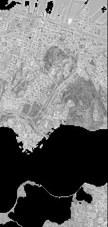
The NDBI statistics for Auckland-region show a mean NDBI value of -0.04, with a median of -0.01 and a standard deviation of 0.16. These values suggest a relatively low level of built-up intensity across the region, with considerable variation in urban development. The minimum NDBI value is -1.0, and the maximum is 0.41. The 10th percentile (p10) is -0.23, the 25th percentile (p25) is -0.12, the 75th percentile (p75) is 0.06, and the 90th percentile (p90) is 0.13. These statistics indicate that while some areas are highly urbanized, much of the region remains less developed. The NDBI maps highlight these patterns, showing areas of high built-up intensity alongside extensive undeveloped land.
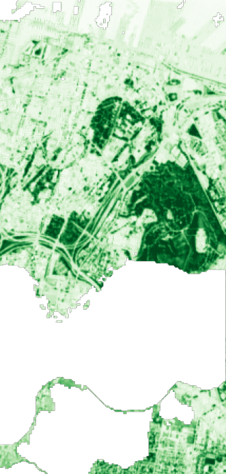
NDVI Color Visualization
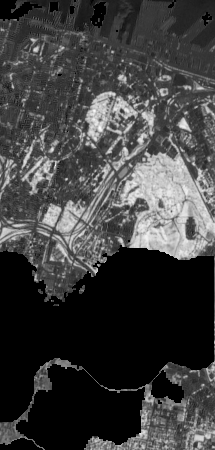
NDVI Greyscale (Index Values)
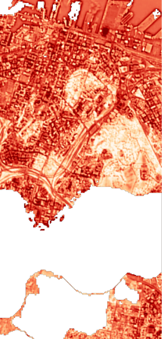
NDBI Color Visualization
NDBI Greyscale (Index Values)
Additional Vegetation & Water Indices
Beyond NDVI and NDBI, three complementary indices provide deeper insights into vegetation health and water presence:
EVI (Enhanced Vegetation Index)
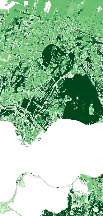
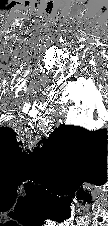
EVI improves on NDVI by correcting for atmospheric conditions and canopy background noise. It is more sensitive in areas with dense vegetation, making it useful for monitoring forest health and identifying vegetation stress that NDVI might miss.
EVI Color Visualization
EVI Greyscale (Index Values)
MNDWI (Modified Normalized Difference Water Index)
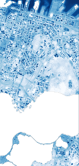
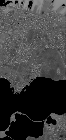
MNDWI enhances water body detection by using green and shortwave infrared bands. It is more effective than NDWI at separating water features from built-up areas, making it ideal for mapping urban water bodies like lakes, rivers, and reservoirs.
MNDWI Color Visualization
MNDWI Greyscale (Index Values)
NDMI (Normalized Difference Moisture Index)
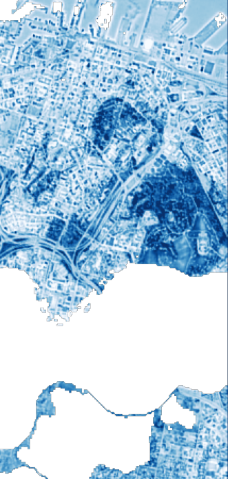
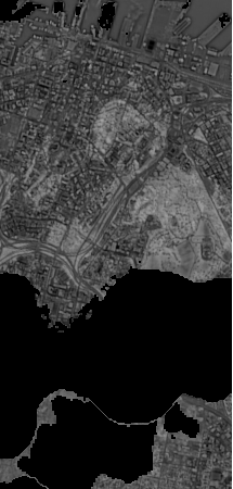
NDMI measures vegetation water content by comparing near-infrared and shortwave infrared reflectance. Higher values indicate well-hydrated vegetation, while lower values suggest drought stress. This index is valuable for assessing irrigation effectiveness and identifying areas at risk of vegetation die-off.
NDMI Color Visualization
NDMI Greyscale (Index Values)
2. Vegetation-Development Balance Analysis
2.1 NDVI-NDBI Difference Analysis
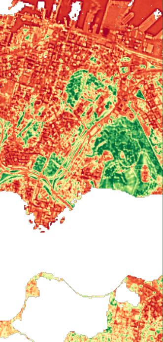
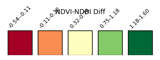
The NDVI-NDBI difference analysis for Auckland-region shows that approximately 6.1% of the region falls into the lowest bin (-0.54 to -0.11), indicating areas where built-up intensity dominates over vegetation. The largest percentage, 41.5%, is in the second bin (-0.11 to 0.32), suggesting a balance between vegetation and built-up areas. The third bin (0.32 to 0.75) accounts for 12.5%, indicating areas where vegetation begins to dominate. The fourth bin (0.75 to 1.18) represents 4.8%, and the highest bin (1.18 to 1.60) accounts for 35.2%, both indicating strong vegetation dominance. The difference map and legend illustrate these patterns, with different colors representing varying balances between vegetation and built-up areas. Positive values (greener colors) indicate vegetation dominance, while negative values (redder colors) show built-up dominance.
2.2 Overlay Interpretation
The combined overlay image for Auckland-region reveals distinct patterns when NDVI and NDBI are viewed together. Areas with high NDVI values (green) and low NDBI values (blue) indicate strong vegetation cover with minimal built-up intensity. Conversely, areas with low NDVI values (red) and high NDBI values (yellow) show high built-up intensity with minimal vegetation. This overlay helps identify regions where urban development is encroaching on green spaces and areas where vegetation could be enhanced to mitigate urban heat and improve ecological balance.
NDVI-NDBI Difference Map (Green = vegetation-dominated; Red = built-up-dominated)
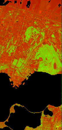
Combined NDVI-NDBI Overlay
3. Urban Heat Island Risk & Thermal Vulnerability
3.1 Heat Risk Distribution
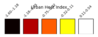
The heat risk distribution for Auckland-region, based on the urban heat index bins, shows that 0.15% of the region falls into the lowest bin (-1.60 to -1.18), indicating areas with the lowest heat risk. The second bin (-1.18 to -0.75) accounts for 4.8%, the third bin (-0.75 to -0.32) for 12.5%, and the fourth bin (-0.32 to 0.11) for 41.5%, representing moderate heat risk zones. The highest bin (0.11 to 0.54) accounts for 41.1%, indicating areas with the highest heat risk. These zones are primarily located in highly urbanized areas where built-up intensity exceeds vegetation cover. The urban heat index map and legend highlight these patterns, showing where the urban heat island effect is most pronounced. This has significant implications for public health, as high heat risk zones can lead to increased heat-related illnesses and mortality.
3.2 Key Findings & Implications
- Total green cover percentage: 21.65%
- Healthy vegetation percentage: 7.16%
- Vegetation health score: 0.453
- Green infrastructure score: 0.224
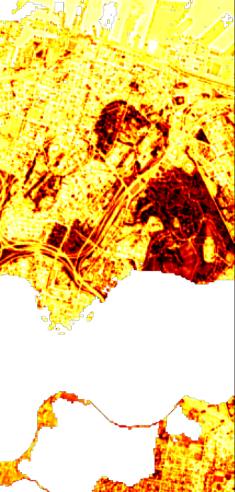
Urban Heat Index Map (Red = high risk zones)
4. Strategic Recommendations for Green Infrastructure
4.1 What's Working Well
- Areas with strong green cover, particularly those with NDVI values above 0.47 (p90), are effectively mitigating urban heat and providing ecological benefits.
- Regions with a balanced NDVI-NDBI difference, falling within the second bin (-0.11 to 0.32), indicate successful integration of urban and green spaces.
4.2 Critical Challenges
- High heat risk zones, particularly those in the highest bin (0.11 to 0.54), lack adequate vegetation cover, exacerbating the urban heat island effect.
- Areas with low NDVI values (below p10 of -0.01) indicate declining green cover, which could lead to increased environmental degradation and reduced ecosystem services.
4.3 Evidence-Based Recommendations
- Implement targeted greening initiatives in high heat risk zones to increase vegetation cover and mitigate urban heat.
- Preserve and enhance existing areas with strong green cover to maintain their ecological and cooling benefits.
- Develop urban planning strategies that promote a balanced NDVI-NDBI difference, ensuring sustainable urban growth alongside green space preservation.
Analysis Coverage Area
The interactive map below shows the exact geographical bounds of this satellite analysis. The colored overlay represents the NDVI coverage area overlaid on OpenStreetMap. You can zoom and pan to explore how the analysis boundaries align with streets, neighborhoods, and landmarks in Auckland-region.
Note: The analysis boundaries may extend beyond administrative city limits as they represent the satellite image crop captured on 2026-04-02. This ensures complete coverage of the urban area and surrounding regions for comprehensive vegetation and heat risk assessment.
Why Urban Green Cover Matters
Urban forests and green spaces are critical infrastructure for healthy, livable cities. Trees and vegetation reduce air pollution, lower urban temperatures through shade and evapotranspiration, manage stormwater, support biodiversity, and improve mental health and well-being. As cities grow denser and climate change intensifies heat events, monitoring and protecting urban green cover becomes essential for public health and environmental resilience.
Satellite remote sensing provides objective, repeatable measurements of vegetation health and urban development patterns across entire metropolitan areas. The Normalized Difference Vegetation Index (NDVI) quantifies photosynthetic activity and green cover, while the Normalized Difference Built-up Index (NDBI) identifies impervious surfaces and development intensity. Together, these indices reveal the changing balance between nature and urban growth—and highlight where intervention is most needed.
Understanding NDVI and NDBI
NDVI (Normalized Difference Vegetation Index) measures the difference between near-infrared light (strongly reflected by healthy vegetation) and red light (absorbed by chlorophyll). Values range from -1 to +1, with higher values indicating denser, healthier vegetation. Typical ranges: 0.6-0.9 = dense forest; 0.3-0.6 = moderate vegetation; 0.1-0.3 = sparse vegetation; <0.1 = bare soil or built-up areas.
NDBI (Normalized Difference Built-up Index) uses shortwave infrared and near-infrared bands to identify constructed surfaces. Positive values indicate built-up areas (roads, buildings, concrete), while negative values suggest natural or vegetated land. When NDBI exceeds NDVI in an area, it signals high development intensity and elevated urban heat island risk.
README Note
Our Mission: We want this research dataset brief to be Simple, Authentic, and Repeatable.
1. Title of the Dataset
Urban Green Cover and Heat Risk Assessment
2. What This Dataset Is About
This dataset was created to help anyone understand how vegetation and green cover in this region is changing over time. It brings together processed satellite data, simple calculations, and a few observations that give the bigger picture.
3. Why This Dataset Matters
At I Hug Trees, we believe that Geospatial Satellite imagery and processed data should be accessible to everyone. While grounded in scientific principles, outputs are presented in accessible formats so that technical imagery and calculations resonate with ordinary people and communities. Because only when it is relatable, can it tell clear stories about our greenery and urban life: shaping how we live, how we breathe, and how we cope with rising heat.
This dataset tries to make that easier. Whether you are a researcher, policy maker, student or just curious about the environment, these numbers and images help you see trends that are not obvious at first glance.
4. Source of the Data
- Satellite: Sentinel-2
- Provider: Microsoft Planetary Computer
- Acquisition Window: Past 60 days (filtered by cloud cover)
- Cloud Cover Threshold: < 30%
- Initial Tile Discovery: Copernicus Data Space Ecosystem browser
5. How the Data Was Processed
Basic Preprocessing:
It is important to get the right tile from the Sentinel-2 database for imagery processing. The browser feature from the Copernicus Data Space Ecosystem helped us identify the correct tile, its bounds, and the subset coordinates needed for extraction. It is always essential to double-check the preview image to verify that the fetched tile truly corresponds to the target region.
Next, we used an AWS Lambda environment for the bounds-discovery phase. This step involved fetching band data from the Microsoft Planetary Computer for dates where cloud cover was below 30% within the past 60 days. Once the acquisition date met this condition, we moved to AWS EC2 server scripts written in Python to download raw band data and process them into COGs (Cloud Optimised GeoTIFFs) along with additional indices.
These processed COGs and index outputs are then used for image displays, NDVI interpretation, and HTML digest features published on our platform. All indices raw value outputs are in JSON files for easy repeatable processing. We currently run this workflow on a quarterly schedule for each identified region.
Cloud Masking:
This dataset uses Sentinel-2's Scene Classification Layer (SCL) to remove pixels affected by clouds, shadows, haze, and saturation. Only surface-clear classes are kept, ensuring that the vegetation indices are calculated from clean, reliable pixels. The masking is applied at the pixel level, meaning every index (NDVI, EVI, etc.) is computed only on valid areas after stripping away noisy regions. This results in more trustworthy COGs, cleaner previews, and more meaningful temporal comparisons.
Calculation Formulas Used:
NDVI = (NIR − Red) ÷ (NIR + Red)EVI = 2.5 × (NIR − Red) ÷ (NIR + 6×Red − 7.5×Blue + 1)NDWI = (Green − NIR) ÷ (Green + NIR)NDBI = (SWIR1 − NIR) ÷ (SWIR1 + NIR)
Tools Used:
Data Source: Microsoft Planetary Computer (Sentinel-2 L2A), rasterio, GDAL
Computation: Python 3, NumPy, SciPy, Pillow, Rasterio, rio-cogeo
AWS Pipeline: Lambda (triggers), EC2 (processing), S3 (storage), Bedrock (AI summaries)
Mapping: Leaflet.js, tile layers served from S3
Automation: Python boto3, Cron (EC2 quarterly jobs)
6. File Contents
The dataset includes metadata.json with satellite tile information, various index outputs
(NDVI, EVI, NDWI, NDBI, MNDWI, NDMI), and statistical summaries. Please find the detailed list of files
available for download in the Download Data & Maps section below.
7. How to Use This Dataset
You can explore the NDVI trends, plug the json file into your favourite tool, build visualisations, or compare it with earlier datasets. It's created to be flexible.
8. Leveraging AI
AI helped speed up some parts of the work, like spotting unusual patterns, creating brief insights, and checking for inconsistencies. All metadata and bin-statistics JSON files were loaded and parsed into structured dictionaries, ensuring the AI receives clean, context-rich inputs for stable summarisation and interpretation.
9. Limitations & Things to Keep in Mind
- Cloud cover may affect accuracy
- NDVI has known limitations
- Spatial resolution is 10 meters
- Some patterns may need ground truth validation
10. License / Permissions
Please refer to the How to Cite This Analysis section below for citation guidelines. This dataset is licensed under Creative Commons Attribution 4.0 International (CC BY 4.0).
11. Contact
For any questions, collaborations, or clarifications, feel free to reach out at: nature@ihugtrees.org
Data & Methods
Data Sources
- Satellite: Sentinel-2B Level-2A (atmospherically corrected)
- Provider: Microsoft Planetary Computer
- Observation Date: 2026-04-02
- Cloud Cover: 28.312963%
- Spatial Resolution: 10 meters (NDVI), 20 meters (NDBI, resampled to 10m)
Index Calculations
- NDVI = (NIR - Red) / (NIR + Red) using Bands 8 and 4
- NDBI = (SWIR1 - NIR) / (SWIR1 + NIR) using Bands 11 and 8
- Difference Index = NDVI - NDBI (positive = vegetation-dominated; negative = built-up-dominated)
- Urban Heat Index = Composite metric flagging areas where NDBI > NDVI (high heat risk)
Processing Workflow
Images were processed using Python with the pystac-client and rasterio
libraries. Cloud masking was applied using the QA60 scene classification layer. Statistics
were computed using rasterio zonal statistics and exported as JSON for
analysis. All geospatial outputs are provided as Cloud-Optimized GeoTIFFs (COGs) for
efficient web access and GIS integration.
Limitations
- Analysis represents a single-day snapshot; seasonal and temporal trends require time-series analysis
- Cloud cover and atmospheric conditions affect image quality
- 10-meter resolution may not capture individual trees or small green spaces
- Study area boundaries reflect the satellite image crop, not administrative city limits
- Heat risk is inferred from spectral indices; ground validation recommended for mitigation planning
Download Data & Maps
Images & Visualizations
- NDVI Color Map (PNG)
- NDBI Color Map (PNG)
- NDVI-NDBI Difference Map (PNG)
- Difference Map Legend (PNG)
- Urban Heat Index Map (PNG)
- Heat Index Legend (PNG)
- Combined Overlay (PNG)
- EVI Color Map (PNG)
- MNDWI Color Map (PNG)
- NDMI Color Map (PNG)
Geospatial Data (Cloud-Optimized GeoTIFFs)
- NDVI GeoTIFF (COG)
- NDBI GeoTIFF (COG)
- Difference GeoTIFF (COG)
- Heat Index GeoTIFF (COG)
- EVI GeoTIFF (COG)
- MNDWI GeoTIFF (COG)
- NDMI GeoTIFF (COG)
Statistical Data
How to Cite This Analysis
Recommended Citation
Yaragarla, R. (2026). Urban Green Cover & Heat Risk Assessment: Auckland-region. I Hug Trees. Retrieved from https://ihugtrees.org/data-analytics/sentinel-ndvi/Auckland-region/2026/04/18/digest.html
Satellite data: Copernicus Sentinel-2 (ESA), processed via Microsoft Planetary Computer.
BibTeX Entry
@misc{ihugtrees_urban_auckland-region_2026,
  author = {Yaragarla, Ramkumar},
  title = {Urban Green Cover \& Heat Risk Assessment: Auckland-region},
  year = {2026},
  publisher = {I Hug Trees},
  url = {https://ihugtrees.org/data-analytics/sentinel-ndvi/Auckland-region/2026/04/18/digest.html},
  note = {Satellite data: Copernicus Sentinel-2}
}
License
This analysis and associated datasets are licensed under Creative Commons Attribution 4.0 International (CC BY 4.0). You are free to share and adapt this work with appropriate attribution.
Planetary Computer Citation
If using Microsoft Planetary Computer data, please cite: microsoft/PlanetaryComputer (2022)
Further Reading
Explore related urban green cover analyses and environmental insights from other regions: